Design for print guide

There’s a host of considerations for a designer or layout artist to bear in mind when producing artwork for printing. The following hints and tips should give useful guidelines to avoid some of the most common mistakes – all which can lead to slippages, extra costs, personal anguish and sleepless nights!
Design and Artwork for Print
1. Bleed and Margins:
To get the best results, pages supplied for print must be made up with print considerations in mind! Printed elements running to the edge of the page must extend to a minimum distance beyond the page edge (the ‘bleed’). Typically, a bleed should extend 5mm outside the trimmed area and the live matter kept 5mm inside the trimmed area.
2. Elements across spreads:
Where an element goes across a spread, accurate alignment of the element between the two pages cannot be relied upon. The fold is always subject to a degree of variance in any print run (typically +/- 2mm). Elements that look particularly bad across spreads on final printed results are rules and tint edges (especially diagonals), text and anything which is particularly sensitive to you! Please be aware of this and ‘design out’ conflict where possible.
3. Visual loss with perfect binding and spine glued work:
Perfect bound products do not open flat, therefore there is always an amount of page in the spine area which can’t be seen. Similarly, the spread of glue in spine gluing can cause the centre of spreads to be lost (other than on the centre spread on spine glued work rather ironically). Page elements should avoid this area (10mm margin in the back of each page is usual for perfect binding, up to 4mm for spine gluing.
4. Tracking:
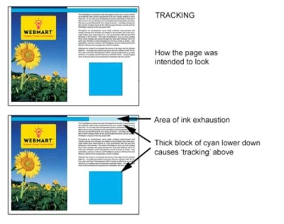
Tracking occurs when ink is “used up” on one element of a page with a high percentage of one or more inks, creating a visible deficiency of that ink within a later in-track element. Particularly noticeable on heavy tint bands running across the web of paper.
5. Bulking:
Bulking is a phenomenon mainly of large saddle stitched jobs – particularly with heavy papers and describes the pushing out of the centre pages due to the thickness of paper in the back. A rough guide is for every 1mm in book thickness allows 1mm less on the page width. An A4 portrait 3mm thick book will have the centre pages at 207mm not 210mm. A very thick book can result in slight tearing at the ‘V’ of the spine. The thicker the book the less satisfactory it looks.
6. Fine lines and tints:
Fine line artwork and small lettering should be designed to reproduce in one colour only to avoid impractical register tolerances. Also, because of technical difficulties in precise alignment of the cover to the text (and often different printing processes that will be used to produce them), try not to have a design running across from the inside front or back cover onto the first or last page of the text. Try to avoid a design with borders running close to the outer edges of the cover.
7. Corrections:
All corrections should be marked on digital proofs. Aim for simple and concise amendments and re-check a new proof after they have been completed.
8. Data and artwork supply:
If you are unsure about how to supply your files it is absolutely vital that you request a specification from your printing services company.
9. Web growth:
Where the cover of a job is printed sheetfed, and the text sections printed web-offset, there will be web-growth, where the text sections take on moisture after being dried by the ovens. This means that after trimming, the text sections can extend out further than the cover by a small amount through the re-absorption of moisture. Please be aware of this, and if it is of concern to you, your printing services company can advise the best way of minimizing the effect visually. Please ask!
10. Cracking:
With any folded product, cracking will occur along the creases. This is where the paper coating splits as it is folded down under pressure. It is especially noticeable on high grammage papers (100gsm+) and where the fold is not trimmed off – e.g. A folded poster. Cracking is less noticeable if the job is designed with an area of white along the fold. High ink coverage and grain direction of the paper can exacerbate the appearance of cracking.
11. Press passing:
If high resolution proofs are supplied to the printer with the data files these will be used on-press to gain the closest possible match possible after taking into account tracking limitations (see point 4 Tracking). Ink starvation from one page with a high percentage of colour can affect the expected result to a page that is in line but needs less colour, so quite often a compromise is necessary. If no proofs are supplied, the job will be run using ink density readings to the industry standard and the printer’s judgement. Should you wish to see your job on press ask your printing services company who should be more than happy to accommodate, subject to timings/logistics etc being on their side!
12. Loose mechanical inserts tolerance:
For technical reasons, it is unavoidable that the occasional magazine / brochure may contain no insert, double inserts or the wrong insert.
Preflighting artwork for print

What is preflighting?
It’s a process your designer or printing services company (printer, print manager etc.) will put your artwork through to make sure all the data required to produce a great print job is present and correct. The process is usually helped by software which plugs in to existing design or proofing software (such as Acrobat Professional) or standalone software (such as Enfocus Pitstop). But the software can only help so far. What’s important is that you understand the particulars of your print job and know what to look out for so you can resolve problems before they hit the printing press.
Remember. When preflighting artwork, CMYK = good. RGB = bad!
Why preflight?
Pretty well all artwork is delivered as a PDF file to a printer these days. Some smaller printing services companies will accept Quark or InDesign files, but pdfs are more common. Used properly, PDFs help deliver the highest quality of work and reduce production time (improving efficiency and reducing costs too). A pdf is great because it can carry all the essential data a printer needs to get your job on the press, including information on graphics, fonts, trim and bleed. However, if you think all pdfs are created equal, then think again.
A survey we found here shows the extent of failing pdf files and the 14 most common failings. The stats speak for themselves – each one accompanied by a headache for the designer and the potential for deadlines to slip.
The earlier the better
The earlier you detect problems with your artwork, the better. So it’s probably worth preflighting your artwork before it’s sent off for printing. That way, you’ll catch issues yourself, understand what to look out for next time (speeding up your pipeline) and won’t lose time while it’s caught later in the process. That said, all printing services companies worth their salt will preflight check all incoming artwork to make sure artwork received meets their own particular specifications for their presses. If yours doesn’t, they should let you know.
Common problems
Problems you might encounter are very much dependent on the final use of the files (precisely what they’re going to be used for). However, there are some common problems that preflight checking can catch:
- PDF version. It’s essential you’re working to the same PDF standards as your printing services company. PDF standards have changed over time, so working to the same standard is vital. We would recommend PDF/X-1a.
- Image file resolutions are too low (should be a minimum of 300dpi for print).
- Fonts are not embedded in the PDF. Embed all fonts to avoid incorrect fonts being substituted.
- Supply as individual pages – not spreads or printer’s pairs.
- PDF compression used is not compatible – check that compression used to create the PDF is compatible with your printing services company’s workflow.
- RGB was used instead of CYMK – fine for viewing on a monitor, but useless for the printing process.
How to avoid problems
The first step is to speak to your printing services company or print consultant and ask for their advice on preflight checking. Find out their specific artwork requirements when outputting your artwork and make sure your designers comply. Even though your printing services company should preflight your artwork on receipt, if you can get into the habit yourself, you’ll spot problems earlier.
Print Proofs & Proofing
When you place your job for printing, you want to be confident that what you’re seeing on screen is what you’re going to get in your finished product. Proofs are the closest you’re probably going to get before you see the finished printed item dropped on your desk. So here we look at the options available.
The issue here is that throughout the design phase of your project, the chances are you’ve probably not been viewing the project in true-colour anyway. If your project has been designed on a computer, the monitor of the computer needs to be pantone-true and calibrated to ensure very close colour reproduction of the finished item. So if you’ve been viewing on your non-calibrated PC or Mac monitor, then the chances are the colour you’ve been viewing (and are probably expecting from the finished job) is wildly inaccurate from the off.
It’s also worth noting that an image viewed on any monitor screen, even a calibrated one, is from a transmitted rather than reflected light source, which is how the eye views colour on paper. So there will always be some difference between colours on-screen during the design phase and after printing, on-paper.
However, assuming you’ve managed your own expectations and have the pantone references for key colours (such as your company branding and the most important colours/pages in your printing project), then here are the type of proofing options available to you.
And please remember it is your responsibility to check these proofs before printing!
PDF proofs
Sometimes referred to as ‘soft proofs’. These are usually the default proof and are suited to quick turnaround projects where you want to check layout and content only. These are not for checking colour accuracy.
We recommend you view PDF proofs in the latest version of Adobe Acrobat ensuring the overprint ‘preview’ setting is selected in advanced preferences to avoid unpredictable results.
Scatter proof
Used in the design process – these proofs are 90% colour/image accurate. They display areas that are of particular importance to the customer placed randomly on the paper (hence the name) and are useful in checking colour integrity; though they will have the same limitations as a high-res colour digital proof.
High-res colour digital proof
These are 80-90% accurate for colour subject to limitations of the actual paper or substrate used. They are usually whiter and glossier than the actual paper which can impact the true representation of the final product, particularly if the final paper is uncoated.
Digital proofs can only show CMYK colours – special PMS/Pantone colours (eg metallics and neons) cannot be reproduced on digital proofs.
Also bear in mind that applying laminates or other finishes can affect the visual appearance of the print colours, digital proofs won’t be able to show this.
Wet proof
The most accurate (and costly!) proofs which can be used to proof both four colour (CMYK) and special (Pantone) colour jobs. Wet proofs use the exact paper and inks to be used in the final job and therefore give an exact representation of the finished job.
These proofs are not usually done as standard and are likely to cost extra, but could be worth it for colour critical projects.
It’s worth noting that high-res digital & scatter proofs are generally deemed as colour accurate within the constraints of the printing equipment/process/substrate/inks used – all of which vary from the final printed copy.
If in doubt, just ask us! We are happy to help you achieve a result you are proud of!
For further information on our Print Marketing services, click here. Or to browse more articles, return to our blog page here.